
KHL teams logos, jerseys and brands
- Thread starter ult
- Start date
You are using an out of date browser. It may not display this or other websites correctly.
You should upgrade or use an alternative browser.
You should upgrade or use an alternative browser.
hansomreiste
Registered User
Is there any explanation to the deer, buck or whatever it's called obsession of Torpedo? Does it have anything to do with the club or the region? To my knowledge, torpedo is far from being a cute animal while Nizhniy Novgorod is a modern, industrialized city. Was it known for its bucks or what? I mean, even if it was... The team is called TORPEDO. If you're gonna go with bucks, then you need to go with self-propelled, explosive bucks.
SoundAndFury
Registered User
- May 28, 2012
- 11,648
- 5,595
Well it was/is the sign of GAZ. I don't know what's the relationship between team and the factory now but obviously they don't want to distance themselves from the past.
vorky
@vorkywh24
- Jan 23, 2010
- 11,422
- 1,282
Is there any explanation to the deer, buck or whatever it's called obsession of Torpedo? Does it have anything to do with the club or the region? To my knowledge, torpedo is far from being a cute animal while Nizhniy Novgorod is a modern, industrialized city. Was it known for its bucks or what? I mean, even if it was... The team is called TORPEDO. If you're gonna go with bucks, then you need to go with self-propelled, explosive bucks.
As SoundAndFury said, it is connected to GAZ, who is the main sponsor of Torpedo.
A deer is on Nizhny Novgorod coat of arms, see.
Foppa
Future Norris Winner
The deer is nicely rendered - I think that would make a good alternate jersey and nice logo for merchandise but I still like their round logo, I think it's a nice classic looking logo.
The deer is nicely rendered - I think that would make a good alternate jersey and nice logo for merchandise but I still like their round logo, I think it's a nice classic looking logo.
That would imply that Russian teams actually care about merchandise though

Acallabeth
Post approved by Ovechkin
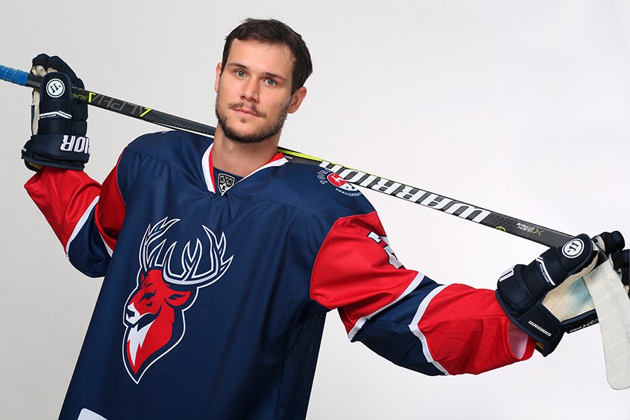
I like this rebranding. The coloring of the sweater is beautiful, the design is simple and tasteful, and while I'm generally a fan of old-fashioned logos, the deer on ice with those stupid stars merged for one of the ugliest monsters in the K history:

So my only worry is that you'll need a real life Adblok to see these colors.

So my only worry is that you'll need a real life Adblok to see these colors.
SoundAndFury
Registered User
- May 28, 2012
- 11,648
- 5,595
Yeah, Torpedo jerseys were ugliest in the league, probably. The new ones look really nice, reminds Amur's jerseys and tiger on them a lot.
Dueling Banjos
Registered User
- Oct 29, 2014
- 7,110
- 5,881
As much as i like old traditional Russian logos but i have to say that the new one is outstanding, the colors are very nice, simple smooth logo, it works.
Definitely a more modern look, the deer looks a bit generic but not bad per se. Ugly sleeves though, remind me of the horrid CHL jerseys designed by Warrior. Blue sleeves with red and white stripes would maybe have been boring and obvious, but also way more elegant.
Atas2000
Registered User
- Jan 18, 2011
- 13,601
- 3,269
Yeah, Torpedo jerseys were ugliest in the league, probably. The new ones look really nice, reminds Amur's jerseys and tiger on them a lot.
So they made them even more ugly. Way to go.
Atas2000
Registered User
- Jan 18, 2011
- 13,601
- 3,269
Is there any explanation to the deer, buck or whatever it's called obsession of Torpedo? Does it have anything to do with the club or the region? To my knowledge, torpedo is far from being a cute animal while Nizhniy Novgorod is a modern, industrialized city. Was it known for its bucks or what? I mean, even if it was... The team is called TORPEDO. If you're gonna go with bucks, then you need to go with self-propelled, explosive bucks.
In this case there is a connection and a history behind it and there is nothing wrong with the buck. You also totally misinterpreted torpedo. It has nothing to do with a device used by the navys of this world. Torpedo is a sports car shape from the early days of car racing. Thus soviet teams sponsored by motor works carried the name Torpedo. The particular motor works of then Gorky now Nizhniy Novgorod had this

on their cars. So the buck and Torpedo are indeed well interconnected and rooted in the history of the city and the team.
Making it a for-kids logo is what bothers me.
Dueling Banjos
Registered User
- Oct 29, 2014
- 7,110
- 5,881
In this case there is a connection and a history behind it and there is nothing wrong with the buck. You also totally misinterpreted torpedo. It has nothing to do with a device used by the navys of this world. Torpedo is a sports car shape from the early days of car racing. Thus soviet teams sponsored by motor works carried the name Torpedo. The particular motor works of then Gorky now Nizhniy Novgorod had this
on their cars. So the buck and Torpedo are indeed well interconnected and rooted in the history of the city and the team.
Making it a for-kids logo is what bothers me.
Interesting, good to know. They could re-brand around classic deer logo then if it's that much part of the history with the direct connection to it. I was a big fan, remove those stick and ice on the bottom and work around it.
Foppa
Future Norris Winner
This is what I see on the VHL website for the second Chinese VHL team, Tsen Tou (Jilin):

Hopefully that is just a placeholder. I remember when KRS came about at first they had a very clip-arty bad logo (like it came from a Double Dragon video game for NES circa 1988) but then the real logo was actually pretty good and nicely rendered.
Hopefully that is just a placeholder. I remember when KRS came about at first they had a very clip-arty bad logo (like it came from a Double Dragon video game for NES circa 1988) but then the real logo was actually pretty good and nicely rendered.
This is what I see on the VHL website for the second Chinese VHL team, Tsen Tou (Jilin):
Hopefully that is just a placeholder. I remember when KRS came about at first they had a very clip-arty bad logo (like it came from a Double Dragon video game for NES circa 1988) but then the real logo was actually pretty good and nicely rendered.
I was searching for that also. I'm hating how the 3 Chinese teams are still kind of invisible! They need to open up.
That logo is awesome, don't be mean

uncleben
Global Moderator
Acallabeth
Post approved by Ovechkin
Would you like this better?Making it a for-kids logo is what bothers me.

Atas2000
Registered User
- Jan 18, 2011
- 13,601
- 3,269
Would you like this better?
It is better. Doesn't mean it is perfect.
Acallabeth
Post approved by Ovechkin

The Moscow Jokerithttps://youtu.be/Cpx-neijUB0
Interesting pass-time channel. All their own opinions and they are very honest they don't really know European/Russian hockey so well. Still its fun to see them comparing the logos.
Those guys should do some research first.Foppa
Future Norris Winner
Better look at Jilin:


A) Is every Chinese team going to be required to feature a dragon?
B) That clipart blue hockey guy...LOL
A) Is every Chinese team going to be required to feature a dragon?
B) That clipart blue hockey guy...LOL
hansomreiste
Registered User

Ad
Upcoming events
-
 BET ON ONLY ONE HORSE WATCH LIVE - ASSINIBOIA RACE 7 - WinnipegWagers: 3Staked: $1,723.00Event closes
- Updated:
-
 Series Winner Edmonton Oilers vs Florida PanthersWagers: 7Staked: $11,973.00Event closes
- Updated:
-
 Game 3 Florida Panthers @ Edmonton Oilers - FLA leads 2-0Wagers: 7Staked: $5,687.00Event closes
- Updated: