BusinessGoose
Registered User
You want another 14 month break?
ThisKeep the Gin and Juice jersey.
Not politically correct, but what the hell. The back of the jersey.
The yellows were perfect if they just added a triangle back to the logo.
You want another 14 month break?
That Penguin holding a Driver would be legit funny.
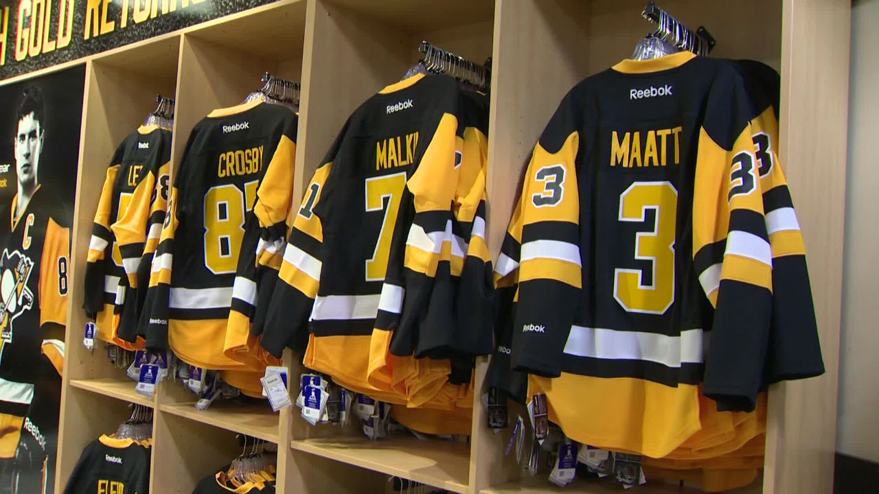
These aka the best jersey in team history. Except not the modern sleek garbage. The true 3 lb jersey with Koho tag and all. FSG has deep enough pockets to pay the fines.
Oh god, that is the most 90s thing I've seen in months. It just needs some Jazz* and probably smells like Fruitopia.Apparently the 94/95 lockout saved us from it becoming reality
Must see: Awful scrapped Penguins jersey design
www.sportsnet.ca
That looks like it belongs with the generation of jerseys in the 90's when the Ducks had the duck leaping out of the ice, the Kings had that strange king head, and that Blues jersey with the trumpets that Keenan nixed.
None of that nostalgia trash.
Maybe just make a new third. Nothing venturing away from the skating penguin. If anything, switch back to the earlier logo.
This....
From this...
That's the WBS Penguins logo. Hard pass.Or better yet, just go with this.
I want them to give the WBS Pens logo tribal tattoos and that lame ass fake mohawk* that middle-aged MMA dads in europe love.That's the WBS Penguins logo. Hard pass.
Not really iconic as the Pens original logo and looks like they are trying too hard.
I miss from before HoG went off the deep end , when you'd all debate high end fashionI would like something new. I'm tired of old retreads. Try something new