OT: Official Jersey and Merch Thread IV
- Thread starter AchtzehnBaby
- Start date
You are using an out of date browser. It may not display this or other websites correctly.
You should upgrade or use an alternative browser.
You should upgrade or use an alternative browser.
saskriders
Can't Hold Leads
I don't see how marketers can look at the success of Arizona, LA, and Anaheim last time and think "clean and boring" is the way to go.
A couple posters can back me up on this, but I was given some info ahead of time.
Sens organization had very little to do with the overall design, and weren’t exactly thrilled with the final product.
Sens organization had very little to do with the overall design, and weren’t exactly thrilled with the final product.
Icelevel
During these difficult times...
- Sep 9, 2009
- 24,974
- 5,141
Wow most of these are pretty bad.
We’re actually doing pretty good in comparison.

 www.espn.com
Seattle, NYR, bruins, LA and MTL should look pretty good out there.
We’re actually doing pretty good in comparison.

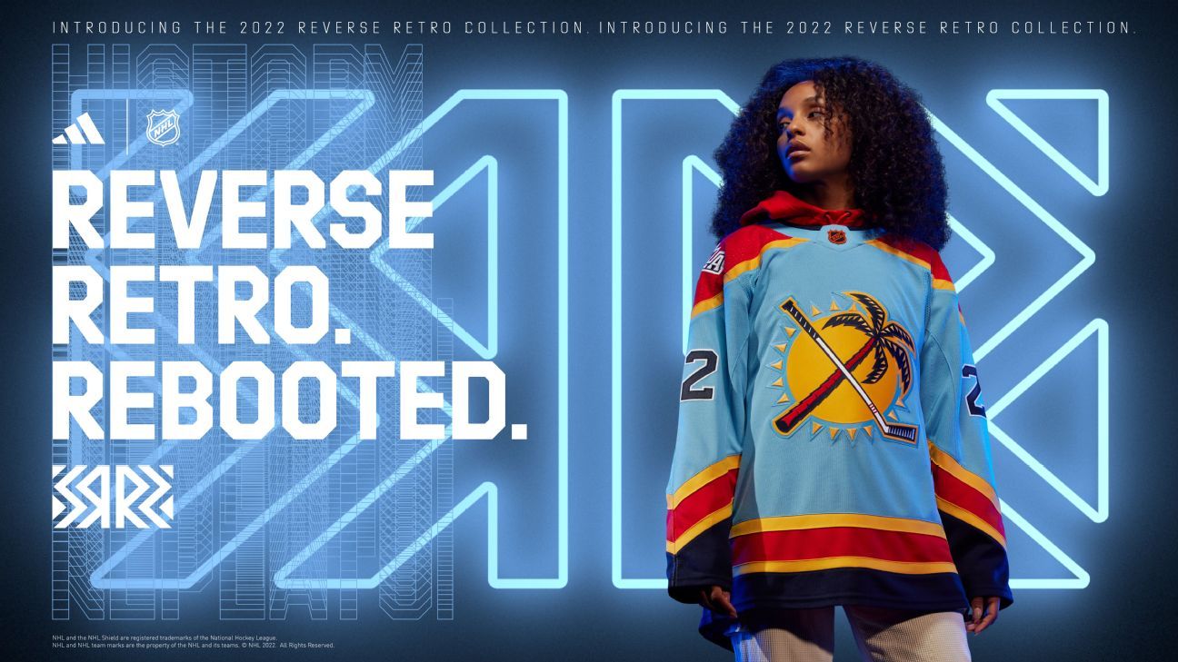
Ranking all 32 NHL Reverse Retro jerseys for 2022-23
The latest set of alternate looks is in. We run down the list, from the elite to the so-so to the head-scratchers.
Seattle, NYR, bruins, LA and MTL should look pretty good out there.
cudi
Mojo So Dope
- Feb 2, 2020
- 8,023
- 12,055
The Professional
Registered User
saskriders
Can't Hold Leads
Hopefully if it was Adidas the next manufacturer does a new theme and gives better designs.A couple posters can back me up on this, but I was given some info ahead of time.
Sens organization had very little to do with the overall design, and weren’t exactly thrilled with the final product.
There are some good ones and some bad ones in this lot.
BonHoonLayneCornell
Registered User
Yikes. Wtf is that Senators abomination?
There's only like 2 or 3 decent ones out of the whole lot and only the Penguins one is "good" imo. What a waste.
There's only like 2 or 3 decent ones out of the whole lot and only the Penguins one is "good" imo. What a waste.
This is what I would have liked to see.
Heck even in black with the modern logo would be good.
ChurchOfAlfie
Registered User
- Dec 4, 2016
- 896
- 1,305
This wouldve been perfect! They need a red jersey and hope this ends up being their alternateView attachment 596378
This is what I would have liked to see.
Heck even in black with the modern logo would be good.
Emerica
Registered User
- May 29, 2010
- 10,985
- 6,319
This. I get a lot of people don’t like the logo but i would’ve liked it for the nostalgia factor aloneShould have gone full Senagoth.
cudi
Mojo So Dope
- Feb 2, 2020
- 8,023
- 12,055
Masked
(Super/star)
A couple posters can back me up on this, but I was given some info ahead of time.
Sens organization had very little to do with the overall design, and weren’t exactly thrilled with the final product.
The jersey looks like a manufacturing error.
Assen na yo!
Masked
(Super/star)
This wouldve been perfect! They need a red jersey and hope this ends up being their alternate
I'd rather see it in white. We should forget about red jerseys and have our identity be black with red accents.
Assen na yo!
Gil Gunderson
Registered User
Just an easy fix. I don't get how you manage to miss that.
Neil Patrick Harris
Now sponsored by Zoom™
Just an easy fix. I don't get how you manage to miss that.
This. The swoosh doesn't work if the swoosh ain't infilled - it just looks like a couple of wavy lines.
Then again, I'll wait to see how it looks on the ice. Seen more than a few bad jerseys look much better in full kit.
Masked
(Super/star)
Just an easy fix. I don't get how you manage to miss that.
I don't like that either. Maybe make the entire swoosh red instead of having two lines? But that's probably just putting lipstick on a pig as well.
Assen na yo!
Ad
Latest posts
-
GDT: ECF: Game 6 - New York Rangers @ Florida Panthers, 8pm ET, ESPN
- Latest: DelZottoHitTheNetJK
-
-
