Im 50, my girlfriend is 20.
I understand, but how do you endure conversations?
Im 50, my girlfriend is 20.
I understand, but how do you endure conversations?
I understand, but how do you endure conversations?
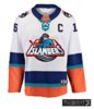
Would anyone else be cool with this jersey? I think for special occasions I'd like this: I actually likes the white version of these jerseys.
The color scheme was different then anyone else. Although I hated the fisherman logo when it was first introduced, it's kind of grown on my over the years and I even purchased an Islanders hat with the fisherman logo on it. Wouldn't mind seeing the fisherman logo as a shoulder patch.


Not opposed at all! Im huge fan of the fisherman, beard or not.I don't know why you're all so opposed to the Fisherman coming back.
It's the Lou York Islanders now, remember ?
View attachment 124065
I don't like em either.I don’t hate them
Lol I’d imagine they’d shrink it down a bit.The "NY" is yuge.
Rumors are Lou is working non-stop to get them signed...We can never have enough 3rd and 4th liners!What team is that? They look like winners! Can we call them up to the big club?
As long as they kinda stick to the Oilers 3rd style I’d be happy.I don’t hate them
I don't know why but i'm pretty sure i've seen this in the kids section in Marshalls on the clearance rack with a different logo. Honestly, orange looks way too bright. Someone designed this on reddit and i'm a huge fan actually.
I die a little bit inside each time someone suggests this.Times have changed, people like tacky nostalgia now - fisherman is the best choice imho
I laugh every time someone gets seriously worked up about a logoI die a little bit inside each time someone suggests this.
Would anyone else be cool with this jersey? I think for special occasions I'd like this:
Blue and orange is one of the best color combinations since they're complimentary colors. Same with purple and yellow (if done correctly like LSU)Dirty little secret no one ever seems to mention: the Isles' Royal/White/Bright Orange color scheme is kind of an ugly combo. We're fortunate that their home and away jerseys are actually nice, but all the other jerseys have been pretty hideous except for maybe this one (probably just because the orange was minimized - the orange is the problem and should not be emphasized, although even on this jersey they just HAD to go overboard with the silver around the NY):

If they HAVE to do a 3rd jersey, I'd like to see them use their colors but alter the hues a bit. Maybe something like a softer, muted light orange stripe at the bottom to represent sand, with the main body of the jersey being a softer blue (water) and white-ish at the top (sky/whitecaps). You know, like the beach. Maybe on the sleeves have a band of thin white/orange/blue/white stripes. And call it a day. Just not busy for Pete's sake.
Blue and orange is one of the best color combinations since they're complimentary colors. Same with purple and yellow (if done correctly like LSU)